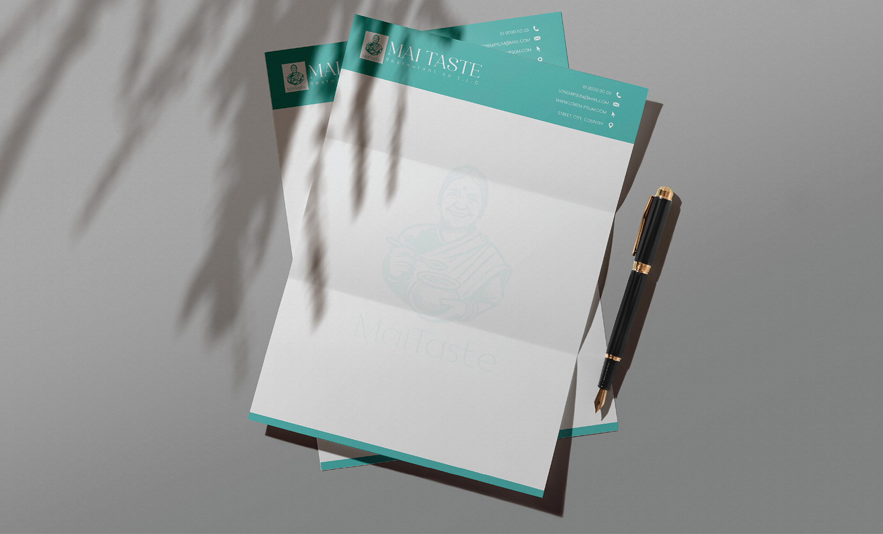
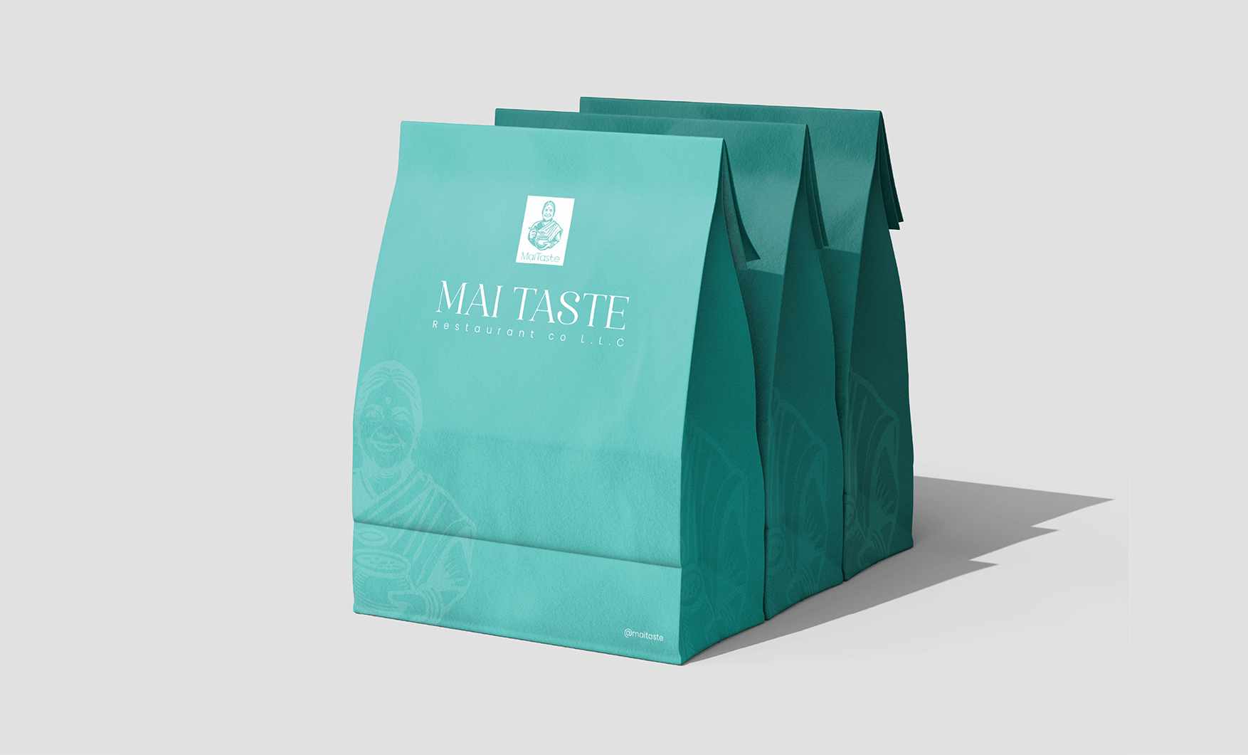
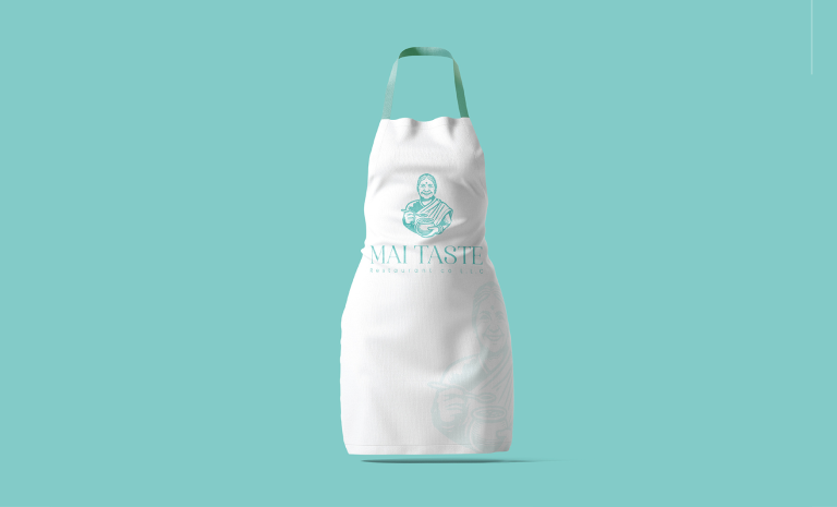
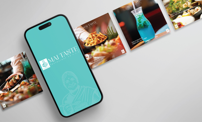
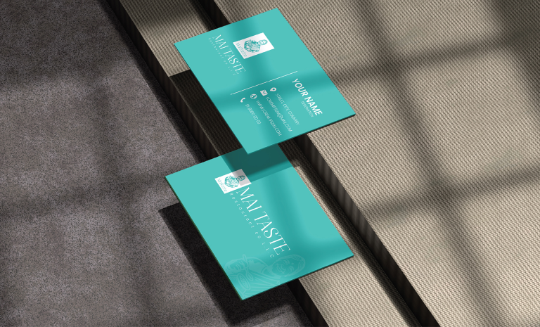
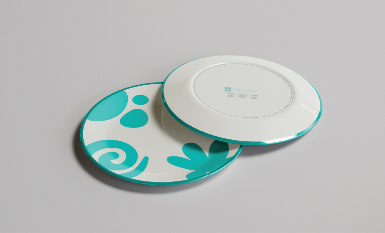
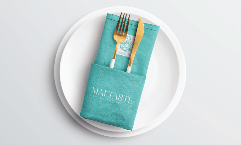
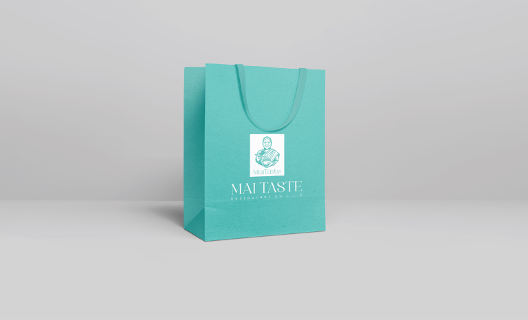
We designed a fresh and inviting identity centered around the illustration of a traditional matriarch — symbolizing authenticity, care, and flavor. The turquoise and white palette evokes freshness and trust, while minimal typography adds sophistication. Applied consistently across packaging, apparel, and print materials, the identity creates a cohesive experience that’s both nostalgic and modern.